
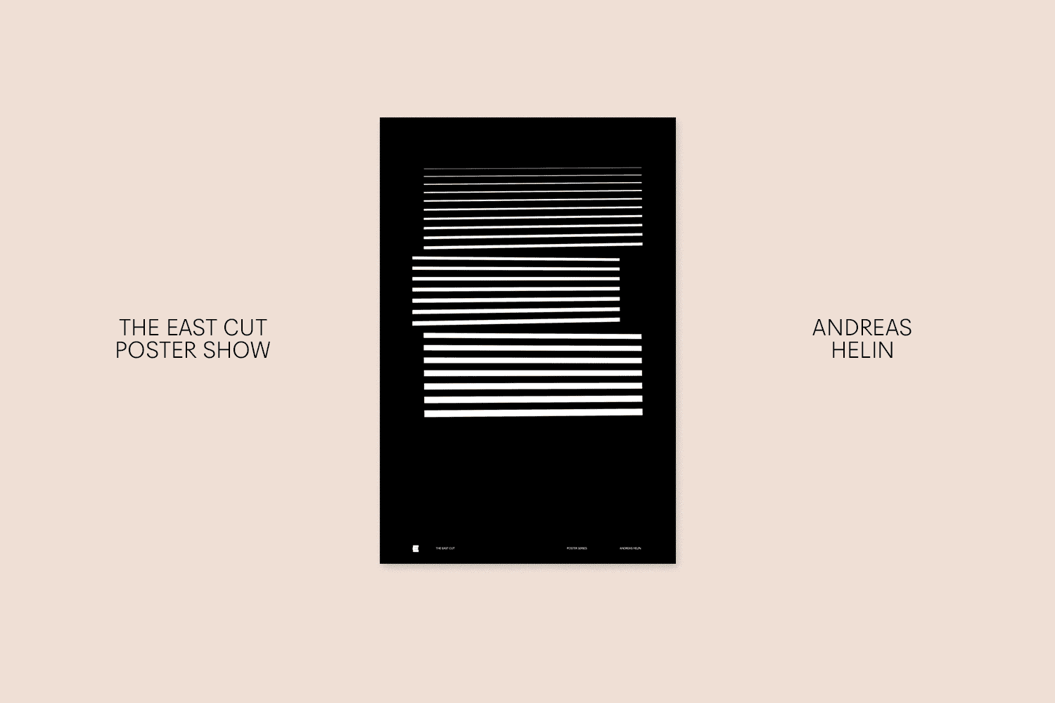
The East Cut brand identity and graphic poster design style
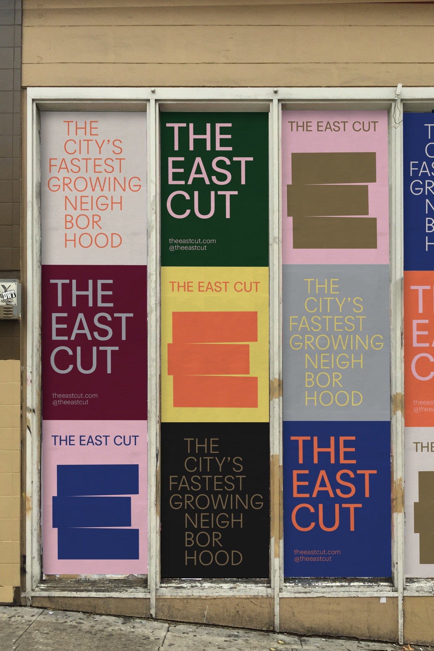
The East Cut is a brand and visual identity system for San Francisco's newest downtown neighborhood. It's designed to unify these disparate areas into one vibrant modern community, it is a distinctive mixture of the new urban suburbs and the older affluent areas.
The new name and graphically minimal symbol was developed by COLLINS . It signals both the place it occupies, as well as its reinvention. The brand identity manages to deliver on both vibrancy and minimalism at the same time - a very difficult design combo. The contemporary use of color and typography perfectly positions the 'look and feel' in a highly creative space. It feels at home in the street or in an art gallery.
![]()


Leave a comment
Comments will be approved before showing up.
+Design Inspiration
-
Popular products, featured projects and interesting things to explore.


Follow
Sign up to get the latest on sales, new releases and more …
© 2024 Cuba Gallery.
All Lightroom Presets and Tutorials are Copyright
Ecommerce Software by Shopify
Andrew Smith
Author
I am a Creative Director living and working in New Zealand, I have a special interest in travel and landscape photography, I also produce presets for Adobe Lightroom.