

typeface
Typography Design Ideas
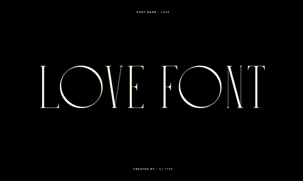
For a while I've been wanting to showcase the full alphabet set of the new Love typeface. As mentioned in a previous post the font was designed in 2018 in Paris by Jérémy Schneider - the typeface is a beautiful blend of contrasting elements, characterised by its big counter-forms and thin stems. Take a look at all the font forms below, both light and dark backgrounds have been included. Perhaps some of the most exciting parts exist in the special characters, the '@' symbol and '&' are superb and worth checking out.
Typography Design
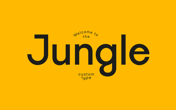
VJ Type recently created this fantastic new custom font for Welcome to the Jungle magazine. The typeface has 4 weights and italics. The stylised upper letter forms have a number of clever customised curves. This create some truly bespoke personality, just take a lot at the editorial layout designs below.
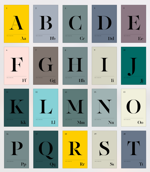
Typography Design | By Panos Vassiliou
Regal Finesse Pro is an exceptional typeface designed by Panos Vassiliou as part of a typography project for Grazia magazine.
Follow
Sign up to get the latest on sales, new releases and more …
© 2024 Cuba Gallery.
All Lightroom Presets and Tutorials are Copyright
Ecommerce Software by Shopify