

business card
Business Card Design Ideas | By Abukoo
A new range of business card designs are now available at abukoo.com. The Adobe Indesign templates come with free fonts and are a mixture of styles - minimalist, quirky and typographic.
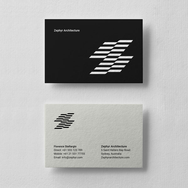
Business Card Design | Restaurant Branding
I recently designed a new minimal look for a potential Sushi Restaurant, love the graphic simple nature of the design. It could potentially expand into a full scale identity system. The project is purely speculative at the moment.
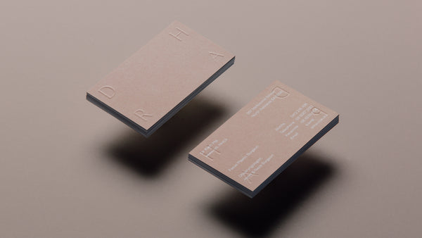
Dr Ha Brand Design | By Studio Simple
Simple is an award winning integrated marketing agency with specialists spanning a full range of marketing disciplines. They cover a wide range of skills including branding, graphic design, digital and advertising all rolled into one sparkling package. Simple recently completed this stunning new identity for Dr Kien Ha (renowned Ear, Nose and Throat (ENT) specialist). They developed a personal brand to reflect the high quality nature of Dr Ha’s services, and to complement this a brand for his private practice.

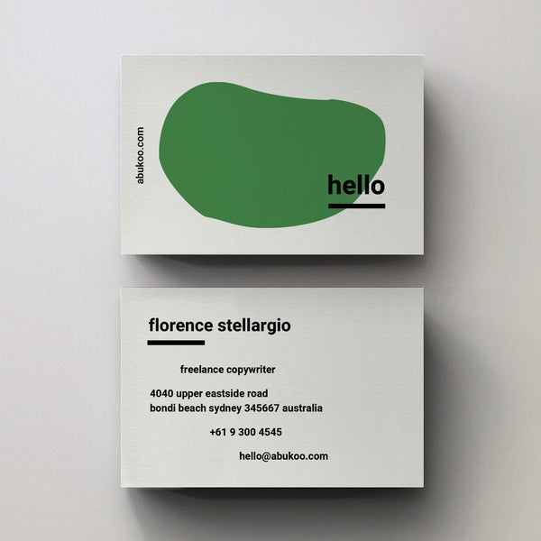
Hello Business Card Design - Adobe Indesign Template
The new 'Hello' series of business card templates are now available on Abukoo. They have an easy to use and quirky style all wrapped up in an editable Indesign template. The template comes packaged with the fonts, with three different abstract 'Hello' designs in green blue and red, you can then edit the greeting to anything you like.
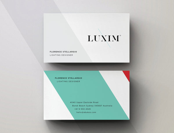
Minimal Business Card Design for LUXIM
I thought a few people would enjoy seeing the minimal business card design for LUXIM. The brand continues express the same stylish aesthetics as the core word mark, but extends the angular graphic elements into the background shapes. The simple clean approach helps elevate the branding into a more sophisticated space, while always keeping the logo as the hero.
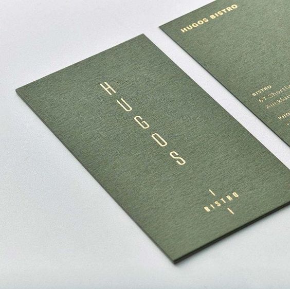
Business Card Design for Hugos Bristro
This beautiful design was created by Hannah Stout for the folks behind Odettes (another eatery that Hannah Stout worked on), Hugo’s is a cozy but sumptuous space with a interior fit-out all about tactility and understated luxury. The design challenge here was to mark out a clear identity for Hugo’s, while still maintaining a subtle connection to its “big sister” restaurant.
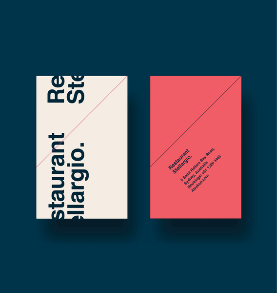
Minimal Business Card and Stationery Design
Inspirational graphic design for Stones Throw Restaurant and Bar
Stone’s Throw is an iconic bar and restaurant that recently under went a full renovation to bring it back to life in the form of a modern watering hole. The design strikes an incredible balance between quirky Illustration, simple texture and sophisticated colour combinations.
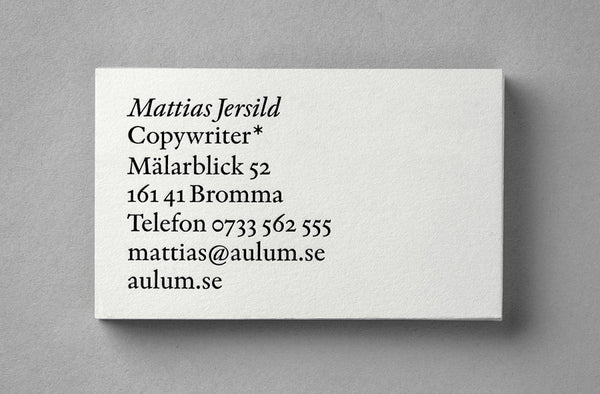
Typographic Business Card: Design Agency BVD
If ever there was a simple design that says exactly what it does - then this is it. This incredibly minimal yet beautifully crafted visual identity plays perfectly to the needs of copywriter Mattias Jersild.
Minimal Business Cards
It's always a huge turn off when some body turns up with tacky self promotional material - in my opinion it can completely change a clients perception of you and your business. I'm currently on the hunt for a few card designs that are perfect for photographers, it's always nice to have something that makes you stand out from the crowd - and for the right reasons.
Follow
Sign up to get the latest on sales, new releases and more …
© 2024 Cuba Gallery.
All Lightroom Presets and Tutorials are Copyright
Ecommerce Software by Shopify