
Creative Home Decor Ideas
Business Card Templates
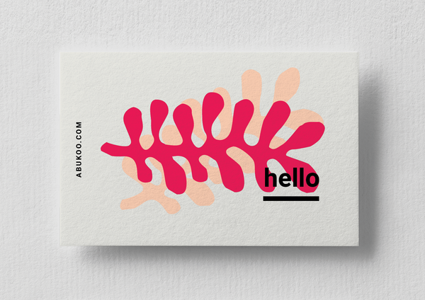
Here are some new business card designs by Abukoo. They have a distinctive illustrated style. Stay tuned for a few for design variants in this space, there are a bunch of alternate color ways included in the pack which give you options to create something bespoke. Check out the new Indesign templates here.
Editorial typography design
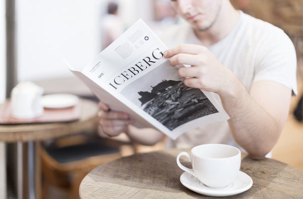
Iceberg is an editorial publication produced for KAE. The publication is itself balances both content, layout and typography in a powerful way. The purpose of the newspaper was to act as a voice for KAE to communicate opinion, discoveries and achievements, while establishing a tone of quality not usually achieved in a standard newsletter or online blog format. The result is a highly designed, informative and visually enjoyable piece of work. With the proliferation of digital content (such as this site!) it's a welcome relief to see such a stunning piece of printed work.
Typography Design
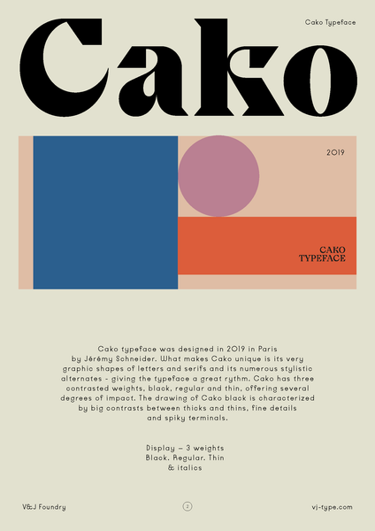
The Violaine & Jérémy studio have now added another stunning font to their collection at VJ-Type foundry. Cako is a quirky combination of unique graphic letter shapes and serifs.
Logo Design Ideas
Julia Kostreva is an American designer who specialises in brand identity, strategy, direction and design. As a brand designer, she helps companies define their strategy and then translate this into a meaningful expression of the brand. Julia's style is both elegant and minimal. Her approach creates timeless and enduring work that seems to transcend design trends. This work extends to both large and small clients – focusing her effort into projects that create the highest impact and most value for growing brands.
Business Card Design | Restaurant Branding
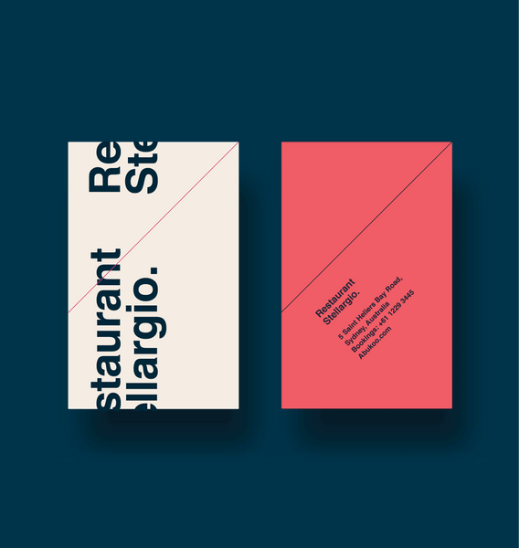
I recently designed a new minimal look for a potential Sushi Restaurant, love the graphic simple nature of the design. It could potentially expand into a full scale identity system. The project is purely speculative at the moment.
Graphic Art Inspiration
Minimal Poster Design
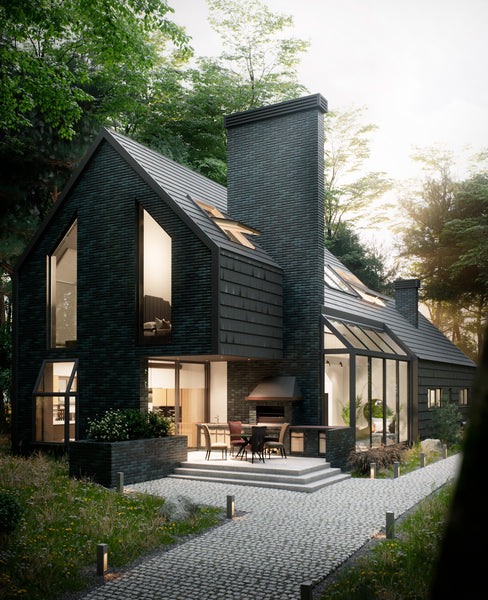
Modern Farmhouse Design
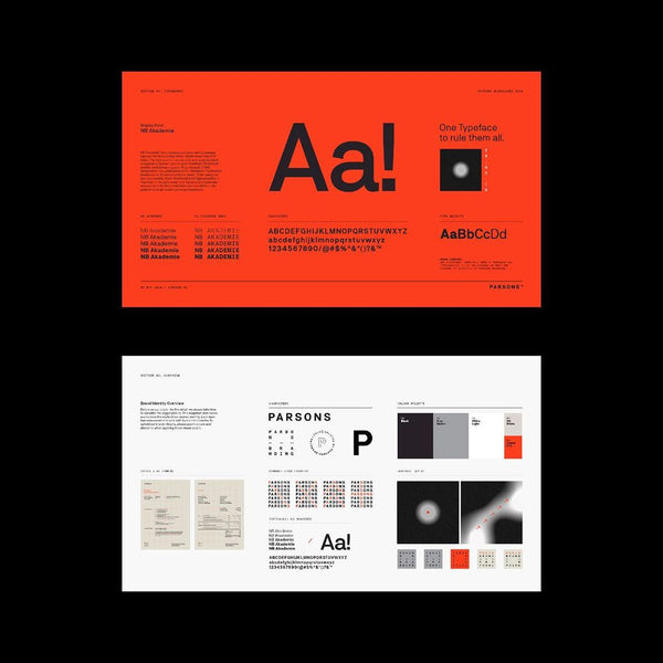
Brand Identity Design | Parsons Branding
Parsons Branding recently completed their own brand identity. The beautifully crafted design system is a showpiece for their core offer. The is firm based in Cape Town, South Africa and have been building a reputation for high end brand strategy and quality creative for over 10 years.
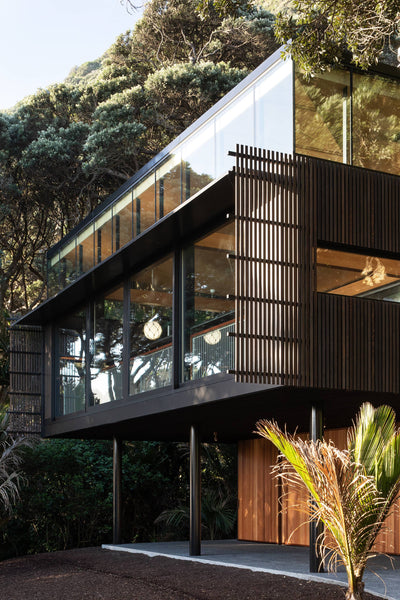
Home Inspiration
Herbst Architects are producing some of New Zealand’s best modern homes, and now they have a string of awards to prove it. Lance and Nicola Herbst have a special gift in defining both style and elegance, the trick is they can do it without indulging every available modern convenience. Their work endeavours to have a positive and meaningful contribution to the environment, rather than just another self serving monument.
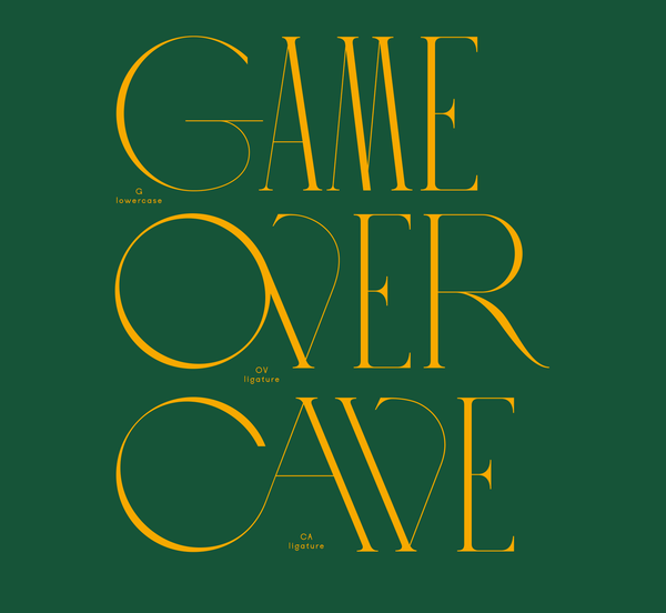
Typography Inspiration | By Violaine & Jeremy
Violaine & Jérémy continue to produce some incredible work, I wanted to keep everyone across some further work showcasing their font sets. This collection of typography stands a long way a head of almost any other ornate collections. The detail and love that has gone into this work is beyond most of us. So enjoy a few extras listed below.
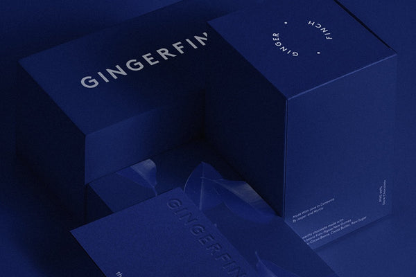
Graphic Design Showcase | Work by SP-GD
SP-GD are a graphic design and visual communication studio based in Melbourne Australia. Their work is a perfect blend of strategic thinking, highly crafted aesthetics and functionality. SP-GD specialise is branding, visual identity, publication design, campaign Collateral, packaging, posters, art direction, design strategy, naming, photography, print production, web design, web development, product design, spacial design.
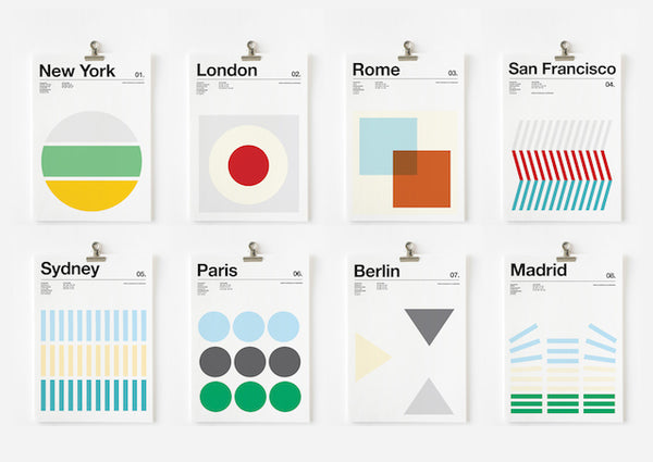
Minimal Typography | By Nick Barclay
Graphic Designer Nick Barclay has decided to pay tribute to cities and their 3 favorite colors through his minimal poster series 'Three Colors Cities'. For the city of New York, the yellow is reminiscent of the color of the taxis, the green is for the Statue of Liberty and the gray refers to the skyscrapers. On the poster of London, we find the red buses and phone booths. You get the idea, it's a fantastic and highly stylish use of the Swiss design style. The approach is something worth bookmarking if you need some killer typography examples.
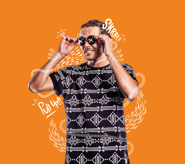
Illustration Design | By Leroy van Drie
Leroy van Drie used a clever combination of photography and illustration to create this high impact campaign for the Encore music scene in Amsterdam. The campaign visuals represent the hip-hop and R&B culture and translate both movement and rhythm into static poster designs. The carefully overlaid doodles and typography give a distinctly creative and human element to the work. The visual energy is a great way to help captures the viewers attention.
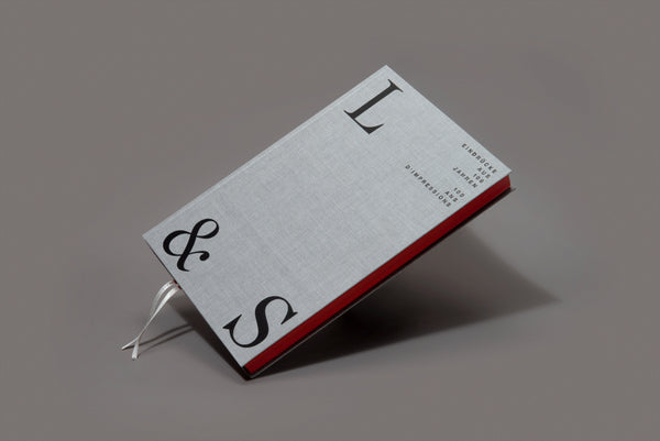
Typography Design | By Raffinerie
This stunning 100th anniversary book was created for Lenz & Staehelin (one of the leading Swiss law firms) by graphic design agency Raffinerie. The book covers many of the events that impacted the company over that time. It's divided into six chapters and shows how the company has transform over a century. The focus is always on the employees, who shape the book, but also the law firm, with their contributions, photographs and impressions. It's a stunning typographic piece that will look as good in another 100 years.
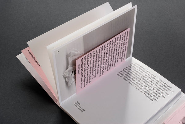
Book Design By Sunda Studio
This graphic booklet by Sunda Studio masterfully blends color, minimal layouts, and typography together to enhance the writers content. The simple editorial format guides the viewer through an intriguing journey on the 'perception of time'. The brochure itself extends into a traditional flip book, where the viewer can enjoy a truly analogue motion experience. It's a wonderfully crafted piece of work, that deserves all the attention it's gained.
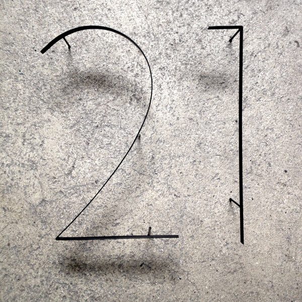
Signage Design | By Nitsche Arquitetos
Absolutely love this signage system by Nitsche Arquitetos. The typography design and execution is great reference for home or commercial way finding. Perfect for adding style to your standard letterbox. Take a look at the full project here.
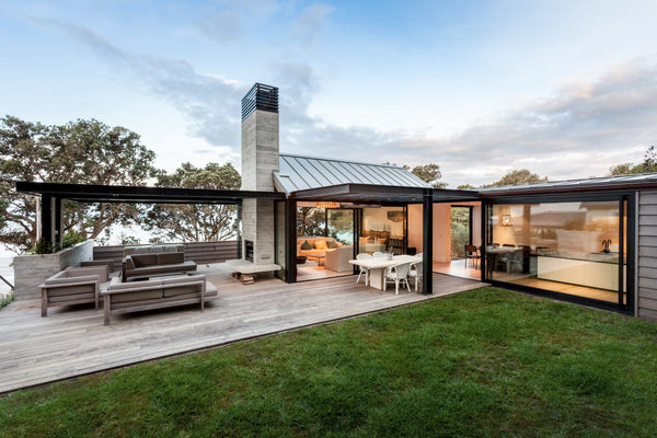
Beach House Design | Architecture By John Irving
This dream style beach house is located in New Zealand on Waiheke Island, the site design plays a careful balance between private and public spaces. The sheltered private courtyard is the showpiece of this property. The small but cozy space has been masterfully crafted to connect with the indoor layout. The exterior materials of stone, timber and black steel is a winning combination - giving it a timeless, rustic and approachable feel.
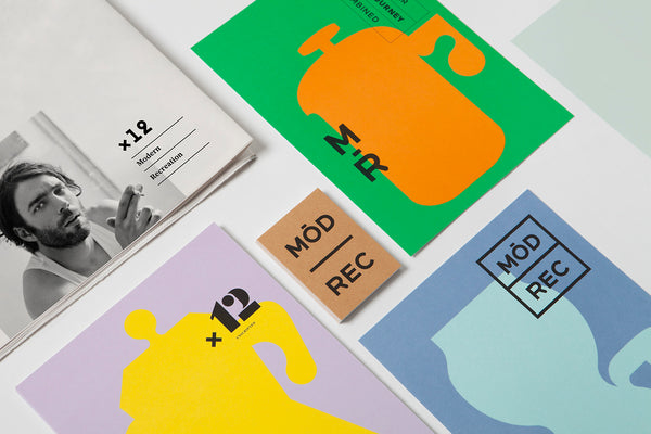
Graphic Design Portfolio | By Blok Design
Blok is a multidiscipline graphic design agency based in Toronto Canada. Their creative strengths include typography, branding, packaging, editorial, websites, digital experiences, art exhibitions and installations. Blok underpin this diverse set of skills with a highly polished and passionate approach to thinking and strategic direction. Typically they collaborate with thinkers and creators, from all over the world, blending cultural awareness with their love of art.
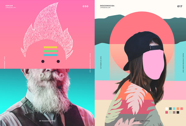
Poster Design Everyday
Inspirational illustrator and designer Magdiel Lopez has challenged himself to create a cool poster everyday. He’s already completed hundreds of colourful designs. Ranging from abstract people, fashion, modern geometric and on to sci-fi rainbow fantasy! The results are truly unreal. It’s a brilliant collection of work, and the design layouts show a masterful approach to both illustration and typography.
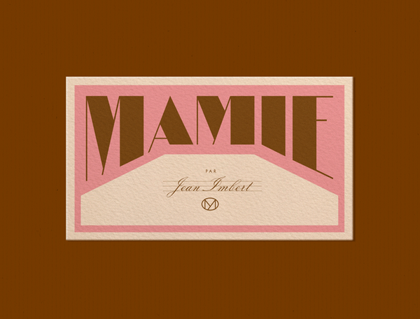
Logo Design for Mamie | By Violanine & Jeremy
Creative agency Violaine & Jérémy have once again impressed us with some bold new branding for Mamie restaurant. The new Paris establishment is run by Jean Imbert and his inspirational Grandmother (who we suspect is responsible for his passion in food). The approach is done in the V&J signature style, where the typography takes a lead role in styling the overall design. The concept is supported by a range of full colour vintage illustrations, which depict hand drawn organic vegetables and ingredients.
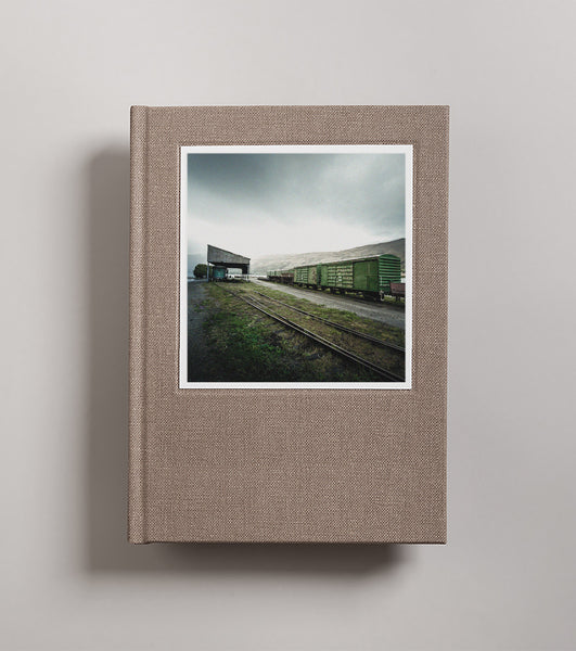
Photography Book Cover Design
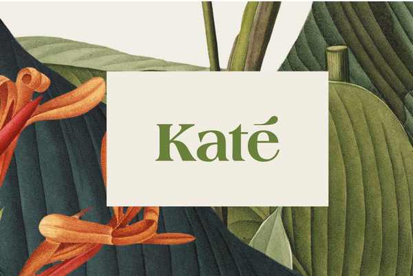
Kate Branding & Logo Design | By Savvy Studio
Savvy Studio recently completed this new branding project for Kate linens. Kate underwent a brand restructure to simplify their many sub-brands and put them under one umbrella. The goal was to establish themselves as a market leader hospitality linen. The new brand evokes ideas of quality, design and effortless luxury - with the key message being everyday ease.
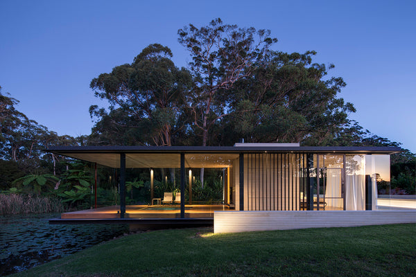
Wirra Willa Pavilion | By Matthew Woodward Architecture
The Wirra Willa Pavillion is a modern glass and sandstone structure on the edge of a natural dam. This stunning piece of architecture is separate from the main residence and provides a place from which to experience the beautifully established landscaping and luxurious natural environment of this rural property.
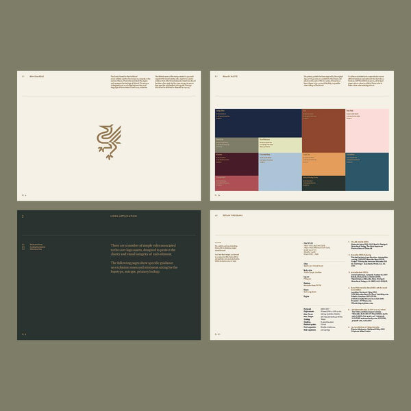
Brand Guidelines Design | By SocioDesign
SocioDesign are London based design agency specialising in design, strategy and brand guidelines. They help transform brands and businesses through carefully crafted design and rigorous strategic thinking.
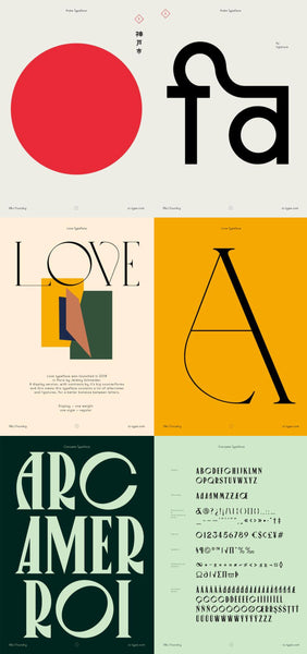
Font & Typography Design | By VJ Type Foundry
The Violaine & Jérémy studio recently launched a fantastic new font offer - the VJ-Type foundry. Violaine & Jérémy specialise in design, typography and font creation, and recently committed to started a bespoke type foundry. Many of the fonts now available for license are custom fonts they produced for commercial projects already delivered.
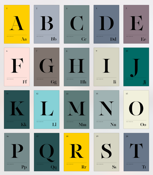
Typography Design | By Panos Vassiliou
Regal Finesse Pro is an exceptional typeface designed by Panos Vassiliou as part of a typography project for Grazia magazine.
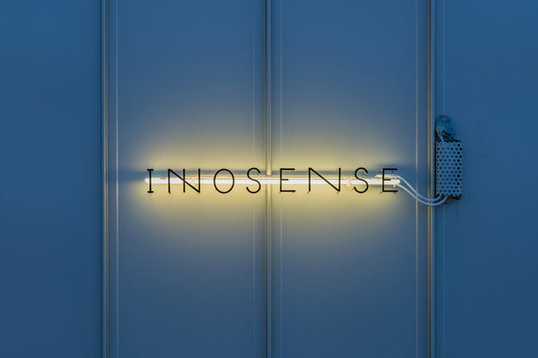
Brand & Signage Design | By Manami Inoue
The Innosense brand and signage design system was produced by Japanese graphic designer and art director Manami Inoue.
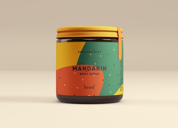
Packaging Design for A Fresh Moment | By Augr
These beautiful and simple pieces of packaging design were produced for 'A Fresh Moment' by Augr Design studio (based in Seoul).
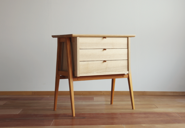
Scandinavian Home Decor | By Katai Kagu Dogu
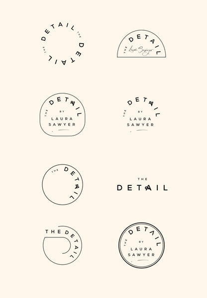
Minimal brand design | By Cocorrina
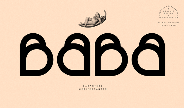
Baba brand identity design and typography | By Violaine & Jeremy
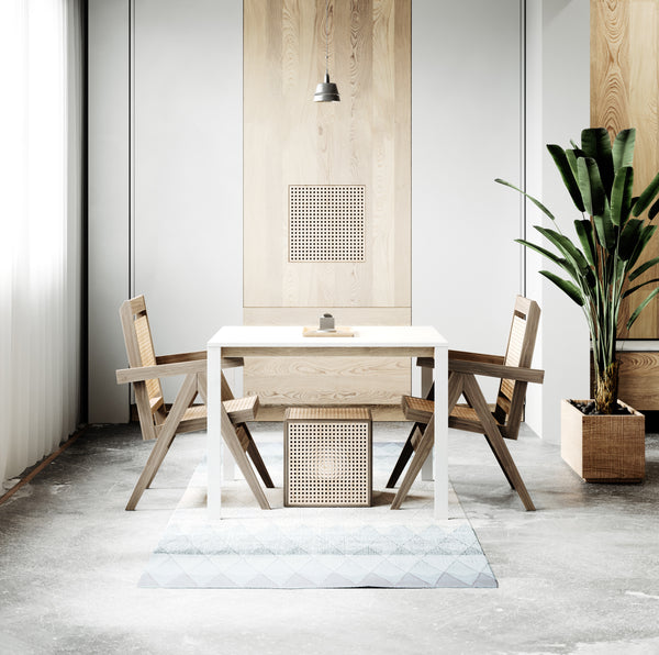
Minimal Home Decor Design | By Karlis Karklins
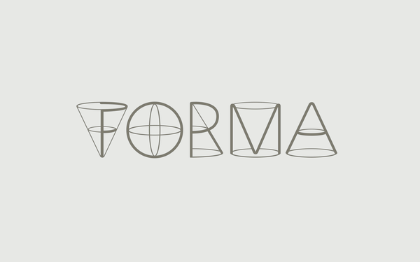
Forma Typography Design
This clever piece of typography design was produced for the Russian Student Industrial Design Contest in Yekaterinburg. It was held during Innoprom exhibition as a key part of the Global Industrial Design Forum. The Forma logotype was produced by 12 Points - a small design consultancy in Russia. They specialize in corporate identity and brand design - they have a special interest developing effective complex and coherent visual design systems.
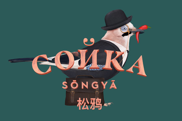
Сойка Logo Design & Branding By Dmitry Gerais
Dimitry Gerais is a Russian designer and brand storyteller who knows exactly how to bring hospitality branding to life. From a logo design through to the over arching brand story and strategy, Dimitry is a master craftsman. The work is completed under his niche hospitality, restaurant and gastronomy design firm nineteen. His agency is dedicated to helping restaurants and gourmet brands create their unique individuality.
